

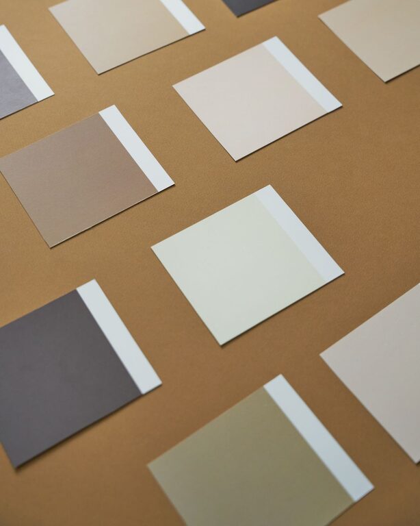
Creating a calm and peaceful environment in your home begins with the colors you choose for your walls and decor. Calm colors help reduce stress and promote relaxation, making your living space a true sanctuary. Whether you’re redecorating a single room or your entire home, selecting the right hues can have a big impact on how you feel every day.
In this post, we’ll explore practical tips for choosing calm colors that suit your style, complement your space, and foster tranquility.
Why Choose Calm Colors?
Colors affect mood and perception. Bright, intense colors can energize, but may also create tension or distraction. On the other hand, soft, muted, and cool colors are known to soothe the mind and body. By incorporating calm colors, you can:
– Create a relaxing atmosphere ideal for unwinding
– Improve focus and clarity in work or study areas
– Enhance the sense of space and light
– Support better sleep when used in bedrooms
Popular Calm Color Families
When aiming for calmness, some color groups stand out for their soothing properties.
Blues
Blue is often associated with calmness and serenity. Light blues remind us of clear skies and water, which can help lower blood pressure and reduce anxiety. Shades like powder blue, sky blue, and pale turquoise work well in bedrooms, bathrooms, and living rooms.
Greens
Green connects us with nature, instantly evoking feelings of balance and renewal. Soft greens like sage, mint, and olive add warmth while maintaining a calming effect. These tones are versatile and look great with natural materials such as wood and stone.
Neutrals
Neutral colors like beige, taupe, soft gray, and cream provide a subtle and unobtrusive backdrop. They create a sense of space and light while allowing other design elements to shine. Neutrals are perfect if you want a timeless and elegant calm environment.
Lavenders and Soft Purples
Light shades of lavender and lilac bring a gentle touch of color without overwhelming the senses. These hues are often linked to creativity and relaxation, making them suitable for bedrooms or meditation rooms.
Tips for Choosing Your Calm Colors
1. Consider Natural Light
Lighting dramatically influences how colors appear. Test your paint samples at different times of the day and in various lighting conditions (natural and artificial). A calm color in bright sunlight may look different than in dim or warm-toned light.
2. Use Color Samples and Swatches
Before making a commitment, paint a small section of your wall or use large color swatches to see how the colors interact with your room’s furniture and decor. This helps avoid surprises and ensures your chosen palette truly feels calm.
3. Opt for Matte or Satin Finishes
High-gloss finishes can reflect too much light and cause glare, potentially affecting the calming effect. Matte or satin finishes provide a softer appearance and better absorb light, enhancing tranquility.
4. Balance with Accent Colors
Using one calm color throughout a space can sometimes feel dull. To add interest while maintaining calmness, introduce accent colors through cushions, rugs, artwork, or plants. Choose complementary shades or muted versions of your main color.
5. Think About Color Temperature
Cool colors (blues, greens, purples) promote relaxation, while warm colors (reds, oranges, yellows) tend to energize. For a calm home, prioritize cool tones or neutrals, but don’t hesitate to include soft warm accents for balance.
6. Create a Color Palette
Combine a main calm color with two or three supporting shades. Tools like online color palette generators or apps can help you visualize combinations that work well together. Aim for harmony and simplicity.
7. Trust Your Feelings
Ultimately, the best calm color is one that makes you feel comfortable and at ease. If you love a particular shade, see how to integrate it in a way that enhances your space’s peaceful vibe.
Using Calm Colors in Different Rooms
Bedroom
Soft blues, greens, or lavenders create a restful environment to improve sleep quality. Consider calming colors on walls, bedding, and curtains. Minimize clutter to amplify the effect.
Living Room
Neutrals combined with gentle blues or greens offer a cozy yet calm space for family time and relaxation. Use textured cushions and natural materials for warmth without excess stimulation.
Bathroom
Light blues, soft greens, and white evoke cleanliness and calmness. They promote a spa-like atmosphere ideal for unwinding. Add plants or natural elements for freshness.
Home Office
Soft gray or muted greens can boost concentration without causing fatigue. Pair with good lighting and ergonomic furniture for a productive yet calm workspace.
Final Thoughts
Choosing calm colors for your home is a simple, effective way to enhance your well-being. By understanding the psychology of colors, experimenting with samples, and balancing tones, you can create spaces that feel both inviting and peaceful.
Remember, calmness comes not just from color but also from thoughtful design and decluttering. Together, these elements can transform your home into the peaceful retreat you deserve.
Happy decorating!